
Insights
Project → Insights. Everything on this tab is worked out from the tasks already on your device. There is no aggregation table, no nightly job and nothing to wait for — which also means it works on a train.
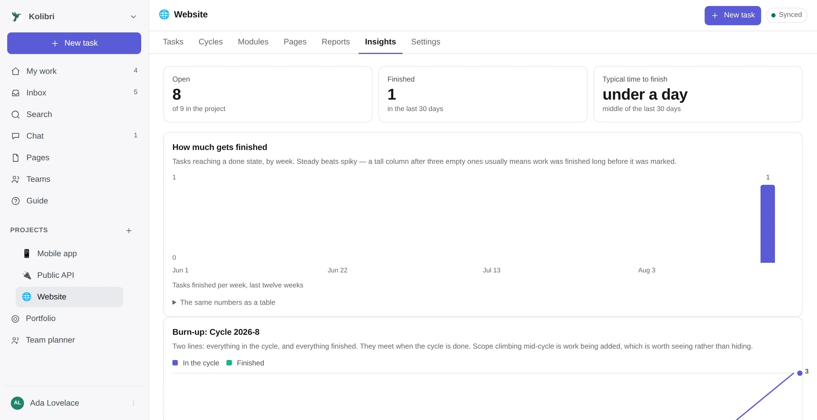
The four numbers
Section titled “The four numbers”| Open | Unfinished tasks, out of the project’s total |
| Finished | In the last thirty days |
| Typical time to finish | The median, not the average — one task that sat in the backlog for a year would drag a mean somewhere nobody recognises |
| Time logged | See time tracking |
The four charts
Section titled “The four charts”How much gets finished — tasks reaching a done state, per week, for twelve weeks. Steady beats spiky. A tall column after three empty ones usually does not mean a good week; it means the work was finished long before somebody marked it.
Burn-up — two lines over the active cycle: everything in it, and everything finished. They meet when the cycle is done. The scope line climbing mid-cycle is work being added, which is the thing worth seeing.
By label — where the tasks are, in the project’s own vocabulary. A task can wear several labels, so the bars add up to more than the project has tasks.
Open work per person — unfinished tasks only. A task with two people on it counts for both, which is why these numbers can exceed the total.
How to read them without being misled
Section titled “How to read them without being misled”Three rules the charts follow, which are worth knowing because they are the opposite of what most dashboards do:
- A zero draws nothing. There is no two-pixel stub for “nothing finished that week”. Ink claiming there was some would be a lie about a bad week.
- Colour is never the only channel. Every chart has a legend where it has two series, labels on the line ends, and the same numbers as a table one click below it. The table is the answer to I do not trust this picture, and to a screen reader.
- One axis, always. Two measures of different scale get two charts, never a second y-axis.
The two chart colours were validated rather than chosen — for lightness band, chroma, separation under protanopia and deuteranopia at full severity, and contrast against the surface they sit on. Dark mode has its own steps, checked against the dark surface, rather than an automatic flip of the light ones.
What is deliberately not here
Section titled “What is deliberately not here”- Nothing across projects. That is the portfolio roadmap, a different screen answering a different question.
- No forecasting. The burn-up stops at today rather than drawing a flat line into the future, because a flat line into the future looks like a prediction and this is a record of what happened.
- No money. These charts count work, not spend. Money has screens of its own, and the two are not merged: one chart carrying tasks finished and euros spent would share an axis between two quantities that have no ratio. There are no hourly rates, which is what would connect them.
- No export button. The table under each chart is copyable, and every underlying row is available over the REST API.