
The five layouts
A project’s Tasks tab has five layouts, and they are five ways of drawing one set of tasks rather than five different screens. Switching between them keeps your filters, your grouping and your selection.
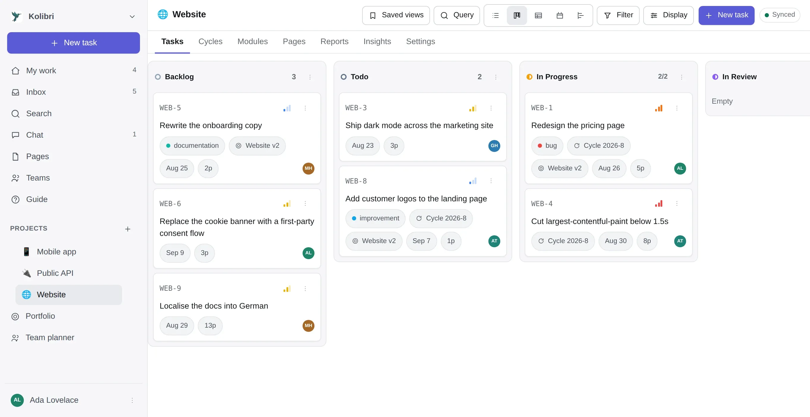
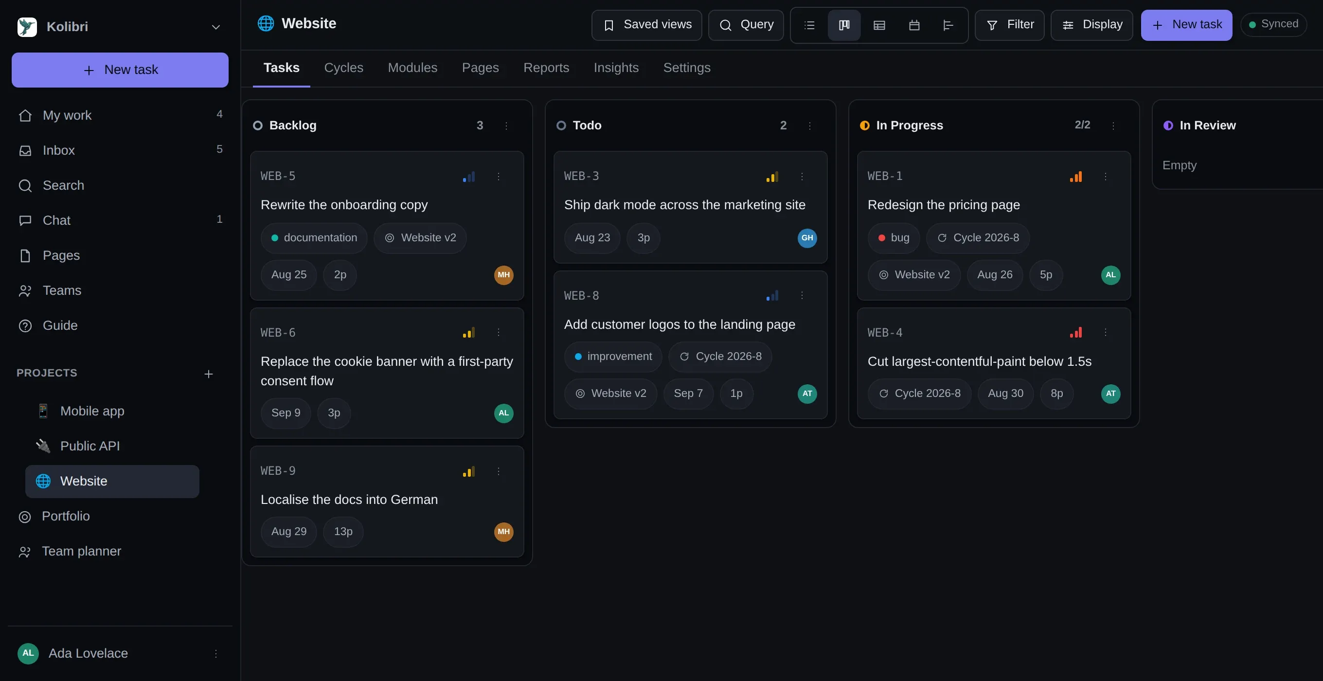
Rows under group headers, with an add button at the end of every group. This is the layout for reading — the most tasks per screen, the least chrome.
Dragging a row onto another makes it a sub-task. Dragging between groups writes whatever the grouping is.
Kanban. Columns are whatever you grouped by, which is your workflow states unless you changed it. Cards carry assignee, priority, labels, estimate and due date, and dragging one writes the value of the column you dropped it in.
The + column at the right-hand end adds a workflow state without going into settings — which is how most teams end up with the Blocked or Review column they discover they wanted in week one.
A column can carry a work-in-progress limit. It does not refuse the drop; it turns the column’s header when you are over it, which is the useful half of a WIP limit without the half that makes people work around it.
A spreadsheet. Sortable columns, every field including custom ones, and inline editing. This is the layout for auditing — which of these have no estimate, which have been in progress for three weeks — and the one to copy out of when somebody wants the numbers in a spreadsheet.
Calendar
Section titled “Calendar”A month grid, drawn from due dates. Tasks with no due date are not on it at all — there is nothing to draw. Dragging a task to another day moves its deadline.
If you want what is due in a calendar you already have open rather than in this one, there is a subscribable feed.
Timeline
Section titled “Timeline”A Gantt: bars from start and due dates, with the blocking relations drawn between them. Dragging a bar moves everything it blocks.
It is a layout, not a separate screen, which is the thing worth knowing about it — the filter you set on the board still applies here, so “the timeline of everything urgent” is one click rather than a second set of controls. A task with no dates is not on it, and the count of those is printed under the chart rather than left for you to notice.
The timeline has the rest: working days, lag on a dependency, and baselines.
The one that surprises people
Section titled “The one that surprises people”Grouping is not a property of the layout. Group by assignee and switch to Board, and the columns are people. Group by a Select custom field and the columns are its options. Group by label, priority, cycle or project and the same thing happens.
That is what makes the board more useful than it looks: a “who is overloaded” board is the same board grouped differently, and a drag on it hands work over. See group, filter, sort.
Where else these show up
Section titled “Where else these show up”The five layouts are the project’s. Three other screens draw work in their own shapes:
| My work | Everything on you, across every project in the workspace |
| Team planner | A row per person, over a window of days. Dragging a task between rows hands it over |
| Portfolio | A roadmap across every project at once — see across projects |